
DPLAY
BRAND IDENTITY & DESIGN SYSTEM
DISCOVERY NETWORKS
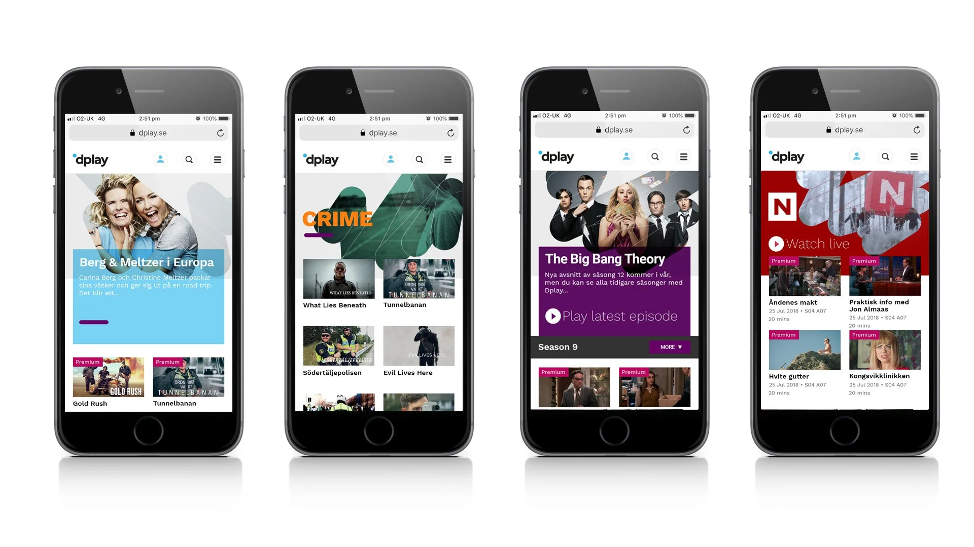
Design and creation of a new logo, visual identity, signature brand expression and design system to position Discovery Networks’ online TV service in the Nordic region, dplay, as a content-rich TV destination.
By removing the generic play arrow, re-crafting the dplay name in lower case and converting the black disc (derived from the familiar globe of the Discovery Networks masterbrand) into a blue ‘microglobe’ icon, a distinctive and contemporary new logo for dplay was created.
The redesigned dplay logo didn’t stay static but played the role of a responsive, active guide, with its own audio mnemonic, navigating people around the dplay offer.
A central part of an integrated design system, a signature brand expression based on a finger swipe motion was created, which helped give dplay an infectiously-enthusiastic brand personality as it brought content to the audience in a set of categories termed “passion verticals”.
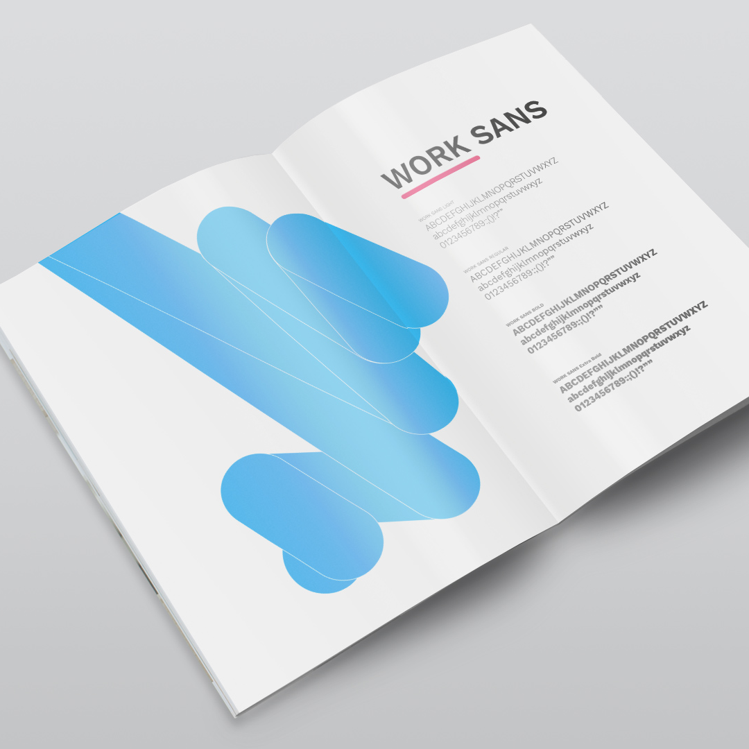
A dynamic font – Work Sans – was selected for the design system to use across all screens and media to complement the logo.
The variety of weights allowed for different hierarchies of messaging, including the curator’s voice, to communicate directly with the audience.
Following the successful launch of the identity in the Nordic region, it was implemented by Discovery in the UK as the basis of a re-brand of six free-to-air channels, with dplay acting as the unifying umbrella brand.