RED PLAYER
UI PRODUCT DESIGN, DESIGN SYSTEM
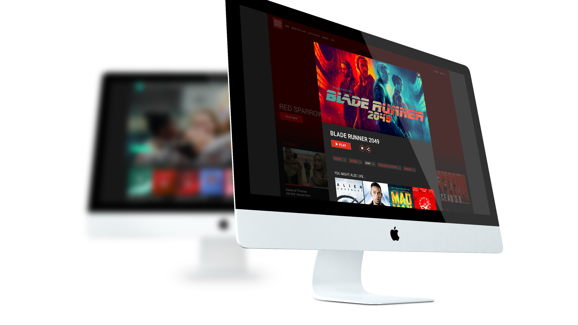
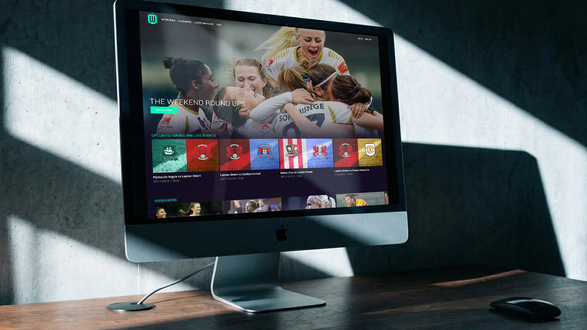
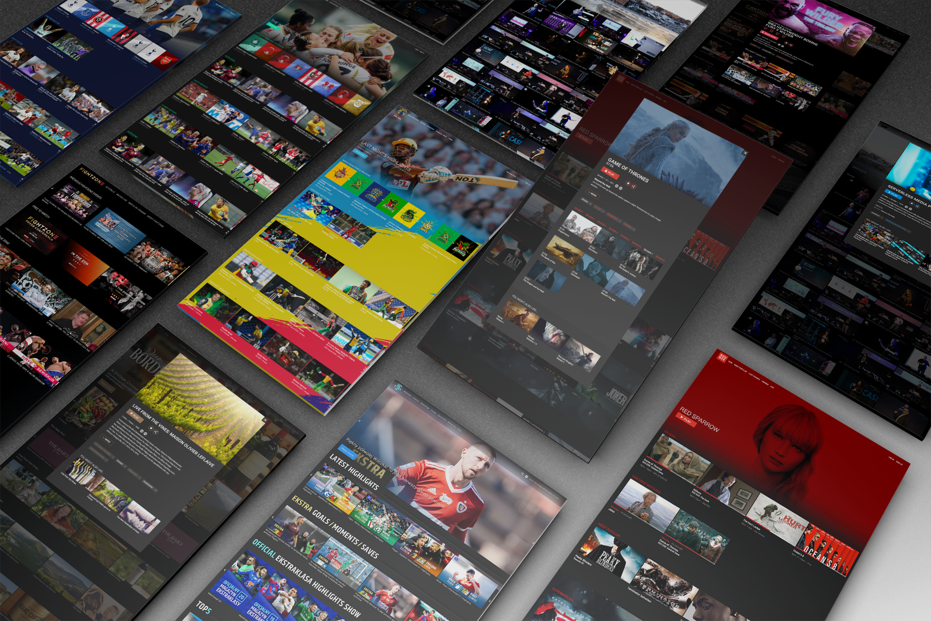
RED BEE MEDIA
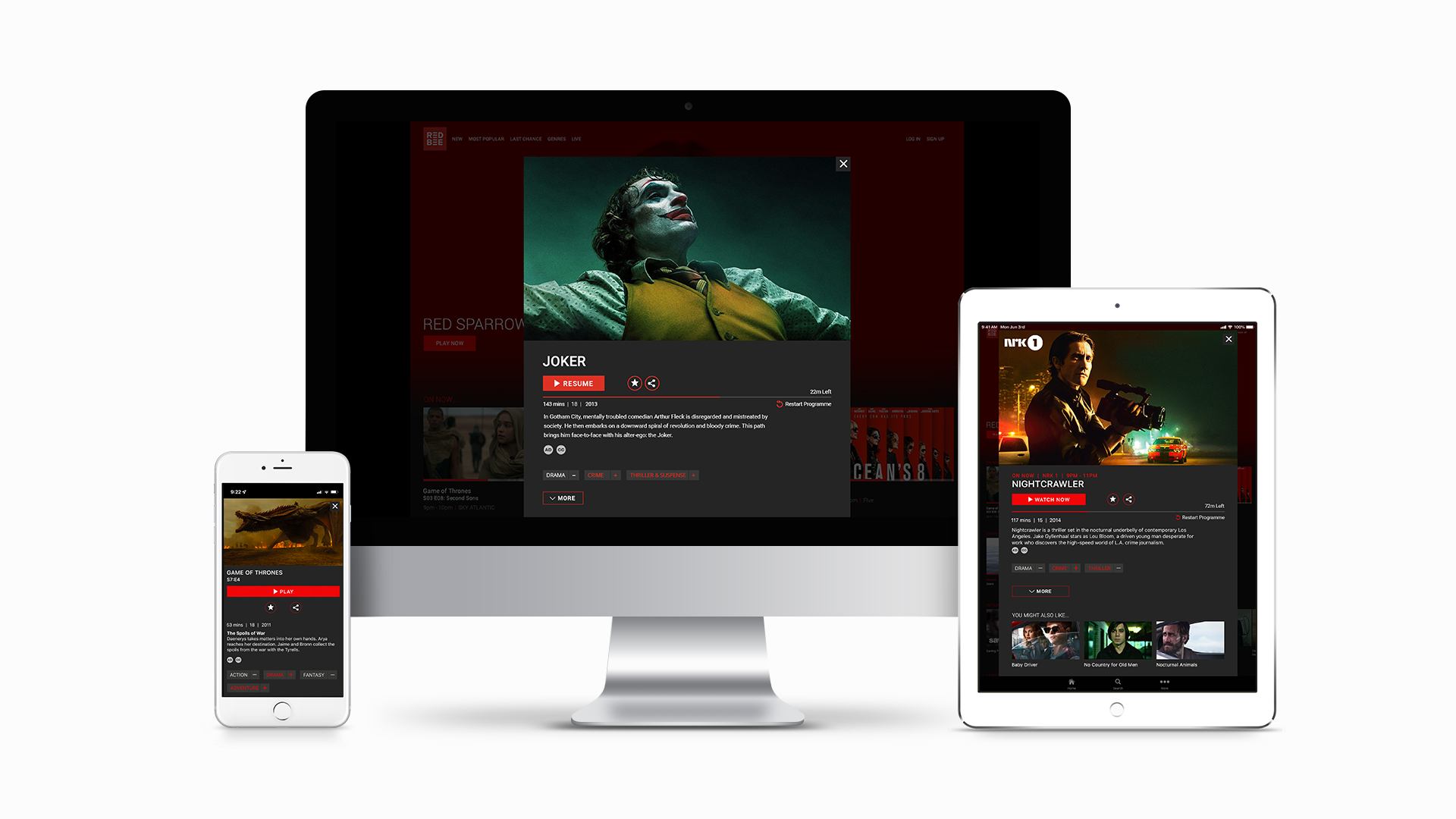
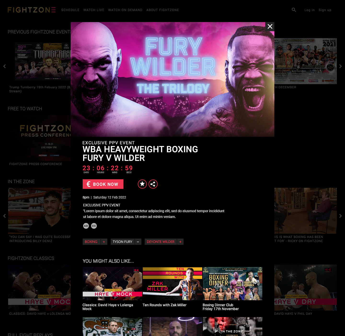
Initiated a new visual design experience for Red Bee Media’s white label VoD product. Establishing a design philosophy for the entire UI & UX, moving Red Bee Media’s offering and approach from a technical driven solution to a user-centred, growth-oriented product, with a focus on improving onboarding, content discovery and conversion across the end-to-end user journey.
Work involved the creation of a consistent visual UI and design system across multiple technology and platform teams that was customisable for clients own brand and requirements.
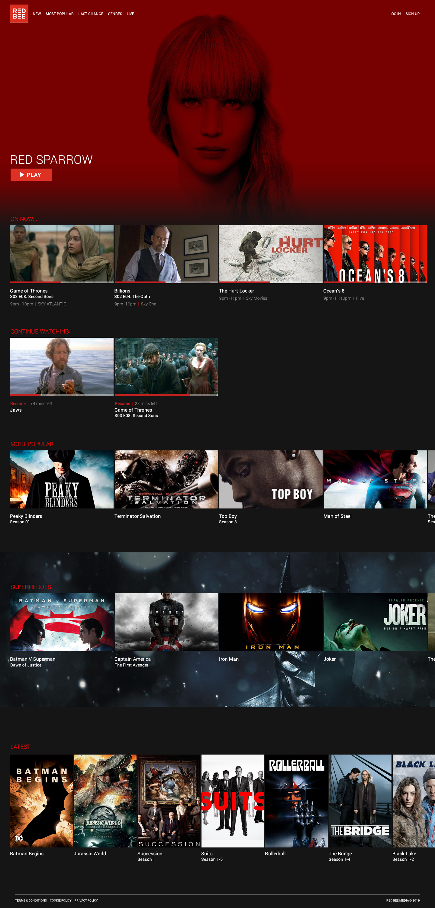
Redesigned the experience to:
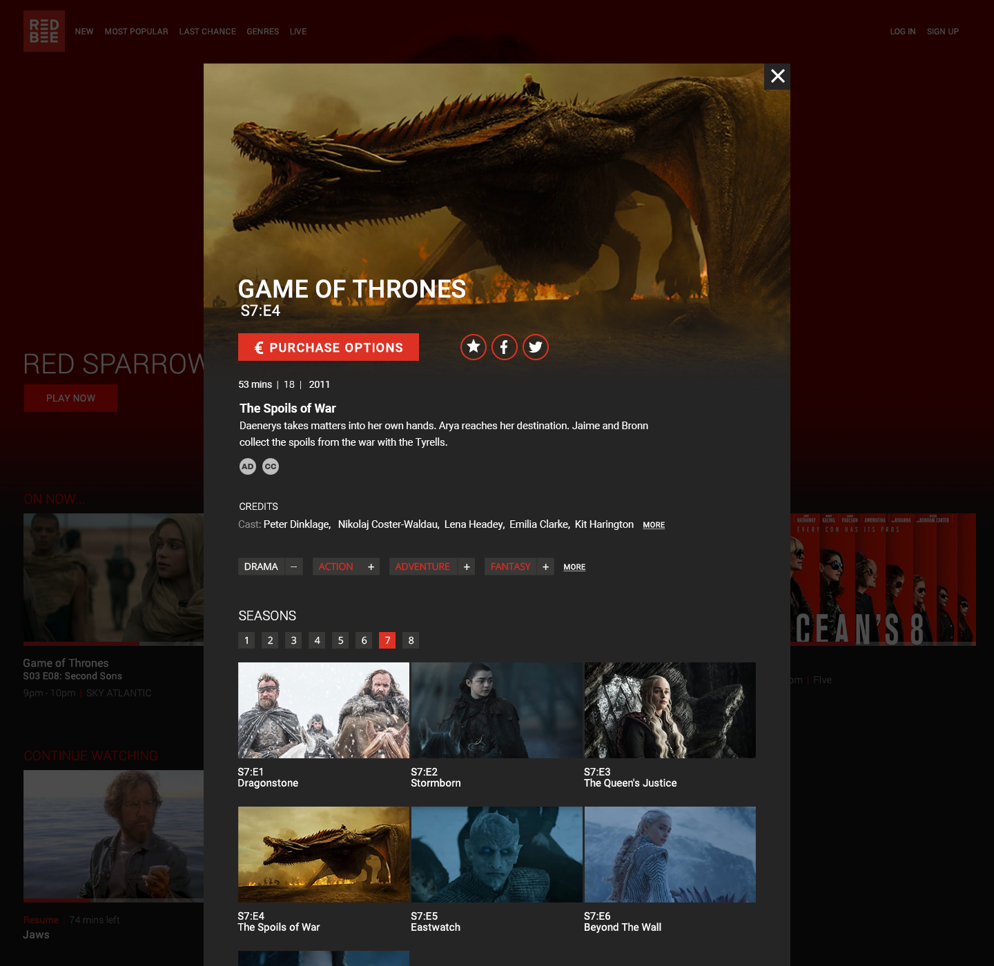
Surface more relevant and personalised content
Balance editorial curation with scalable UI patterns
Improve navigation clarity across large content libraries
Creating more intuitive browsing experience that encouraged deeper exploration and reduced decision fatigue.
Redefined the UX patterns from top level down creating adaptable components and a consistent UI styling across all devices that could be ‘rebranded’ with customers own brand and UX requirements.
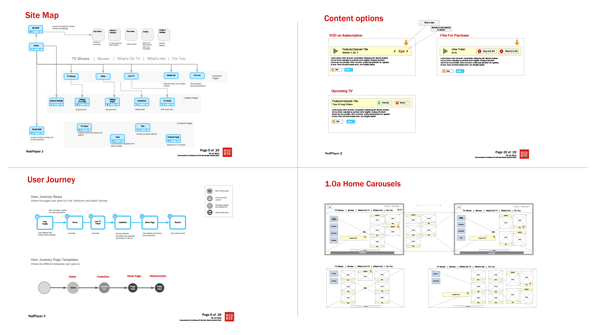
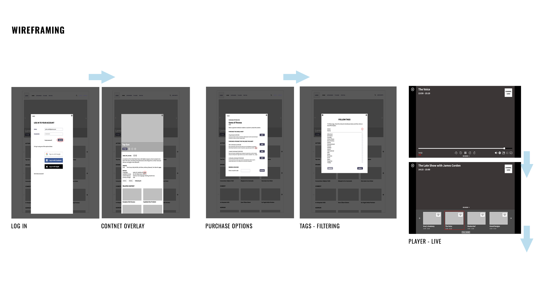
UX DEVELOPMENT
Mapped the full user journey to identify friction and drop-off points across - entry, onboarding & registration, content discovery, player initiation and control and repeat usage.
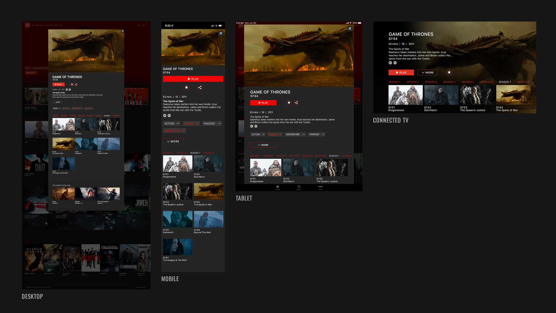
Established a consistent UI visual graphic language to support multiple clients and ongoing iteration:
A scalable design system
Reusable UI components
Consistent interaction patterns across platforms
This enabled faster delivery, easier adaptation for different brands, and laid the groundwork for continuous optimisation and testing.
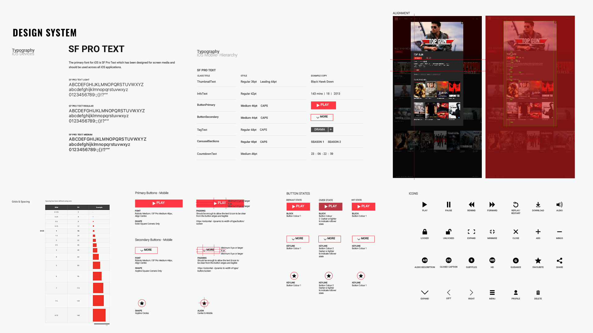
DESIGN SYSTEM
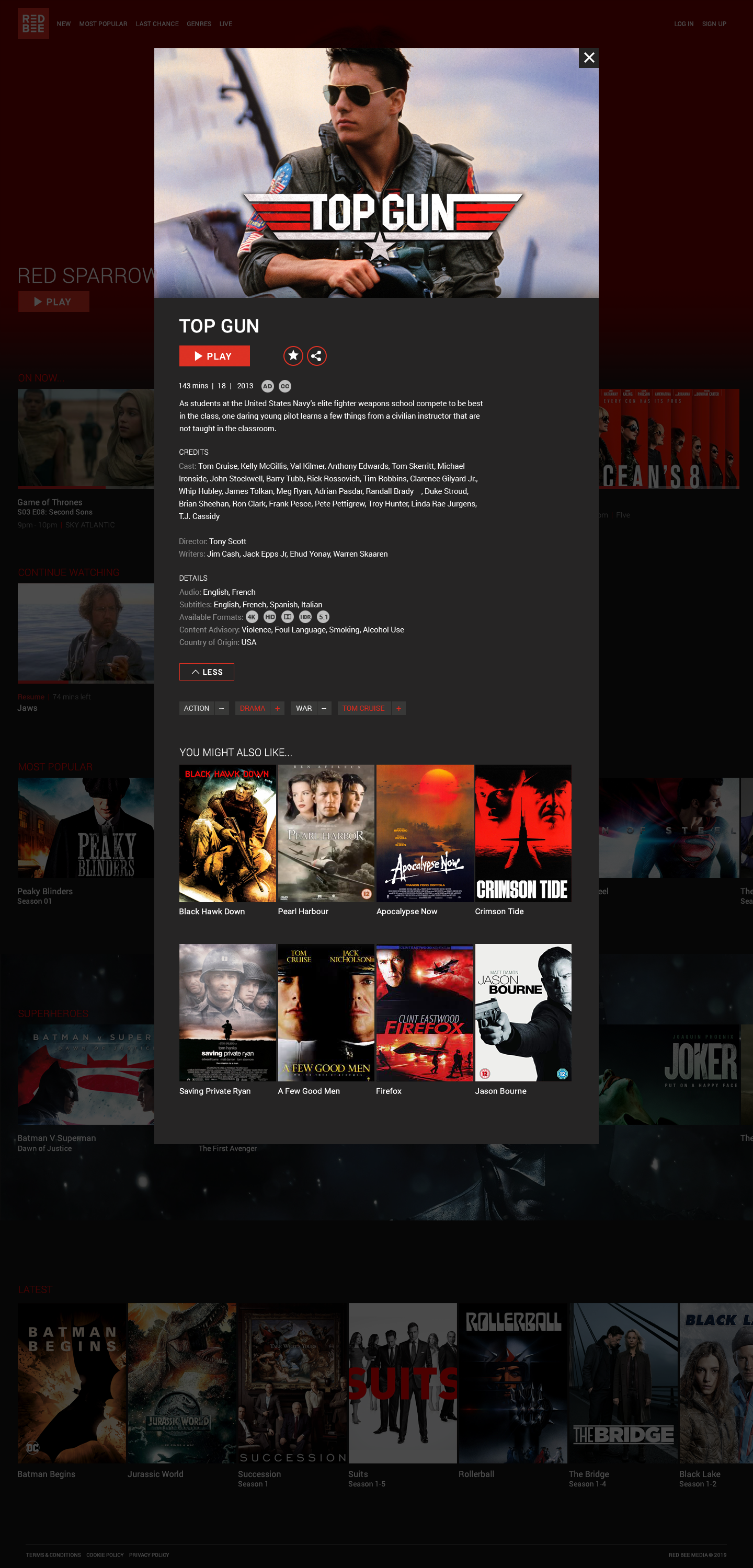
Defined a visual toolkit defining rulesets for typography style and hierarchy, spacing, alignment & grids, shared iconography and button libraries.
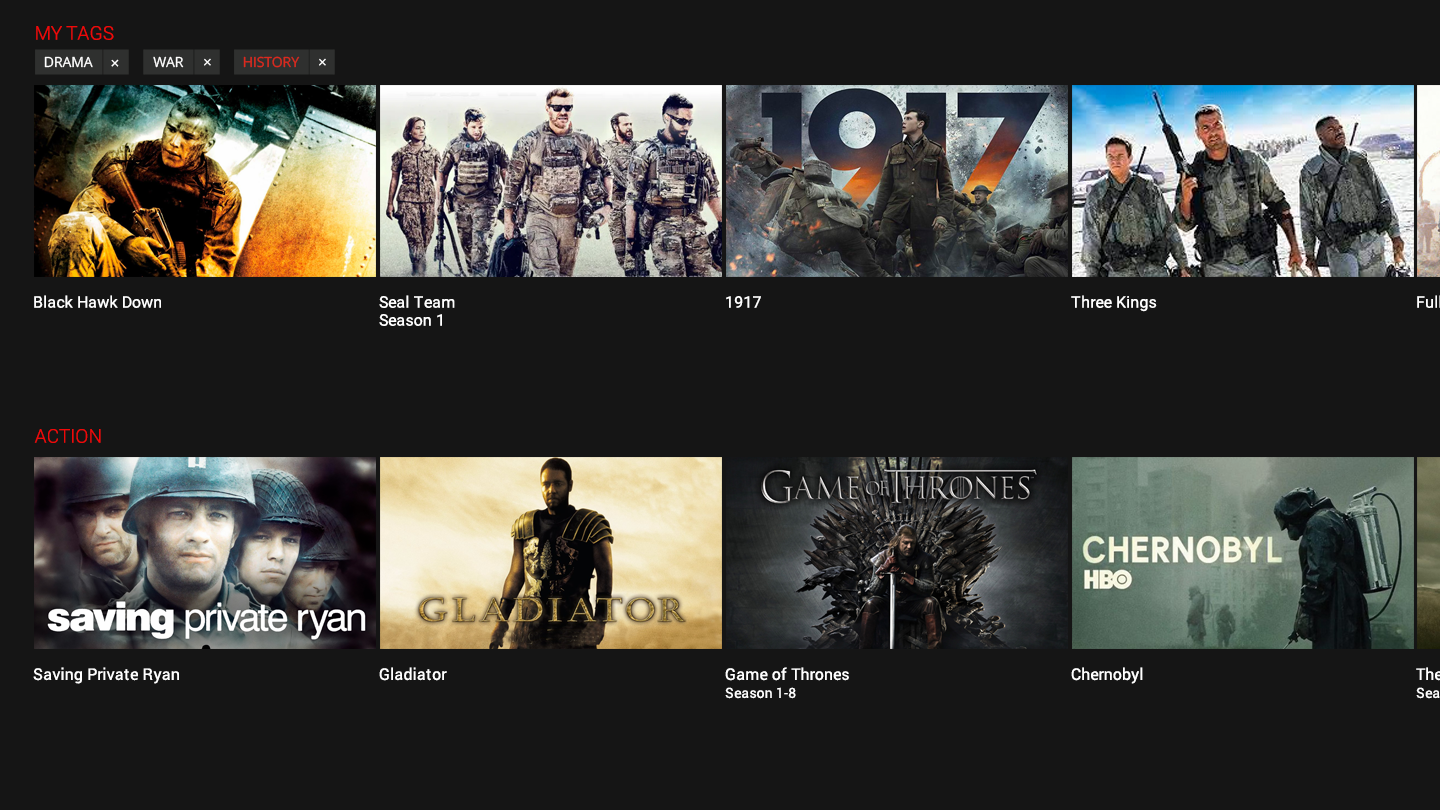
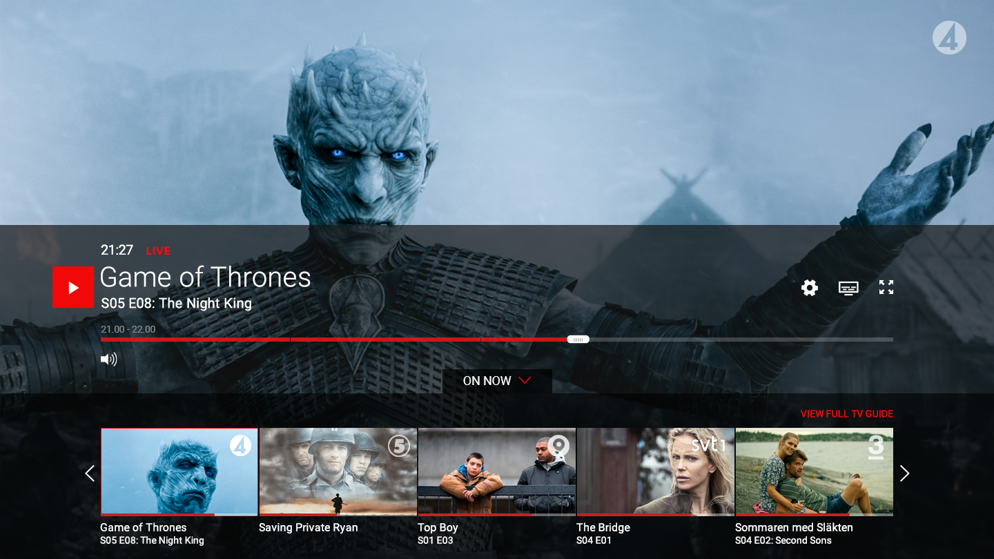
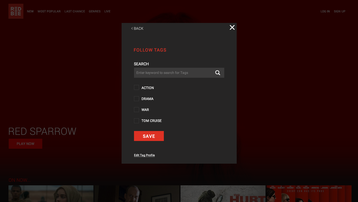
CONTENT DISCOVERY
Unified UX patterns creating a consistent experience across all platforms improving usability and trust and ensure users could discover and play content as quickly as possible, increasing activation rates.
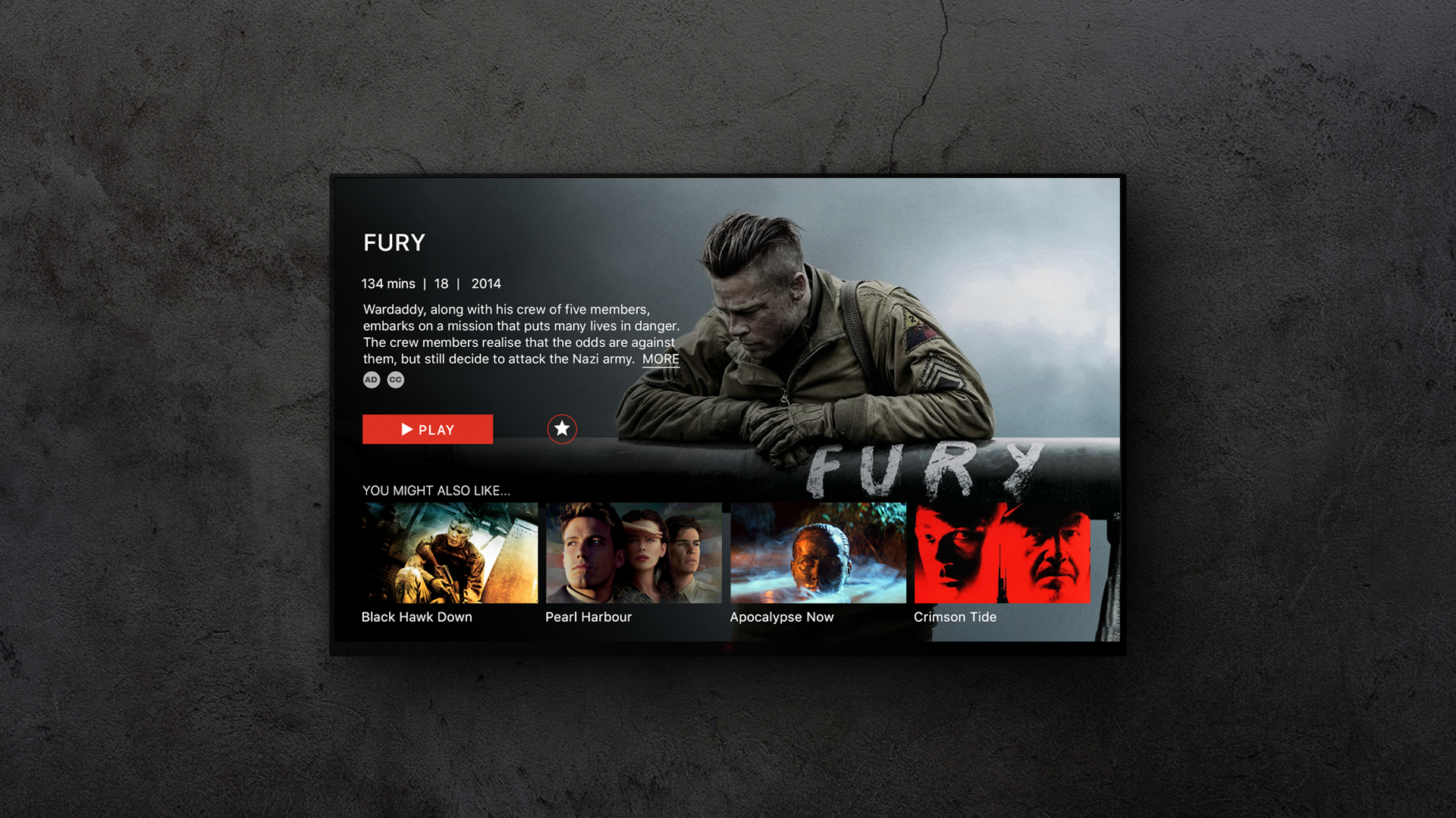
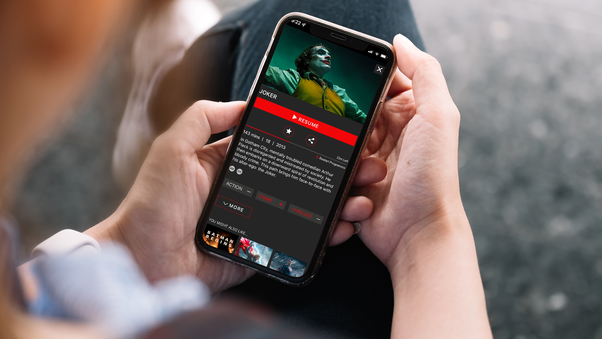
Extended UX functionality to facilitate channel switching directly from the player and tagging to personalise content recommendations creating a more intuitive seamless browsing experience that encouraged quicker and deeper exploration along with more relevant content choice.

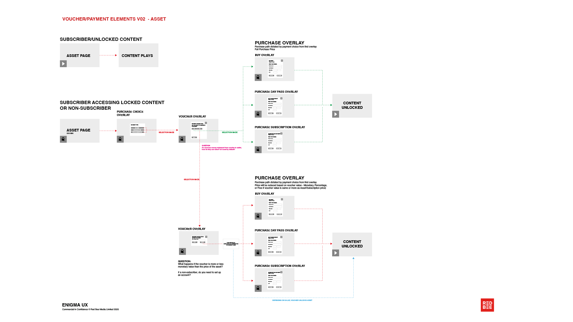
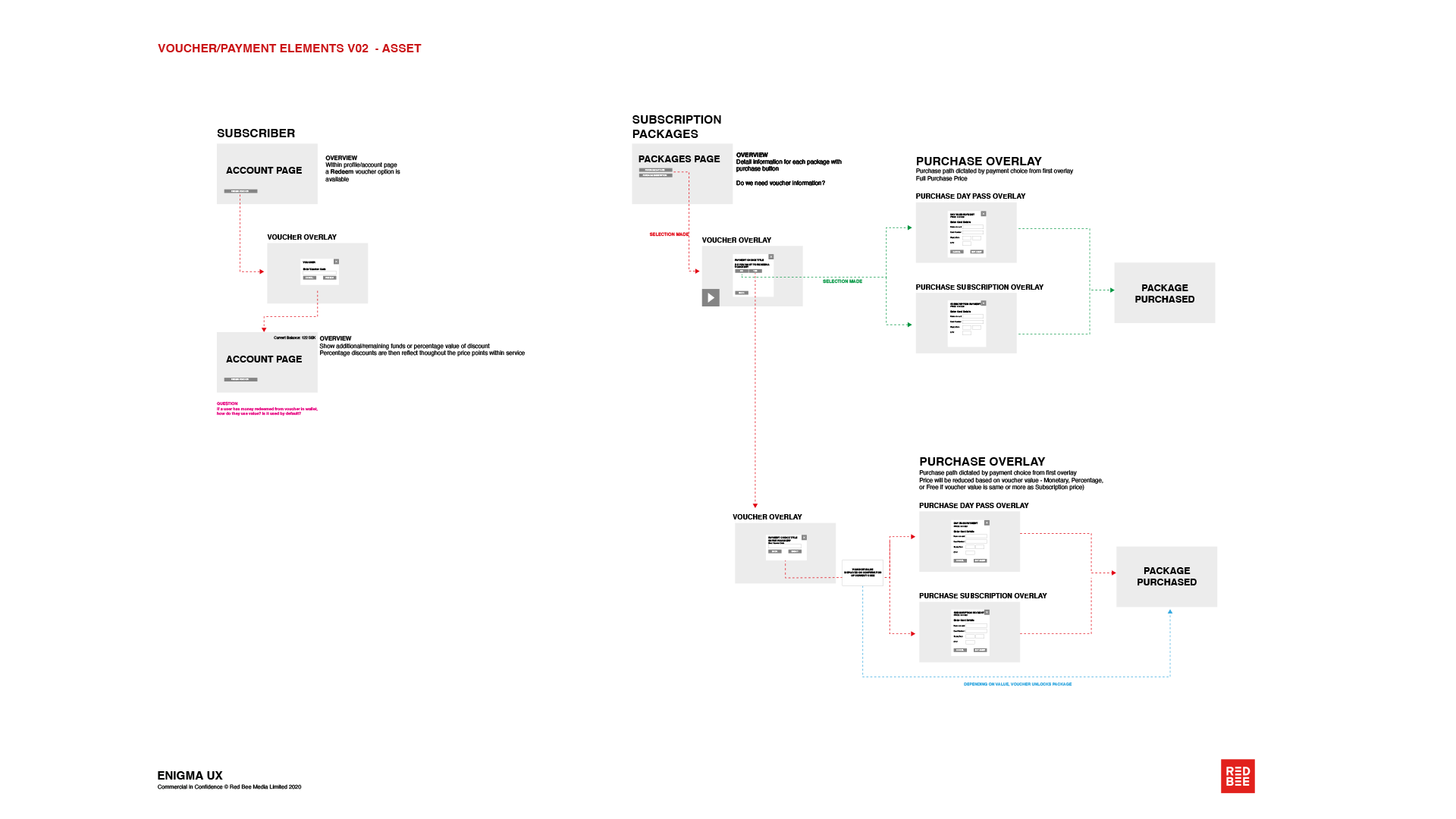
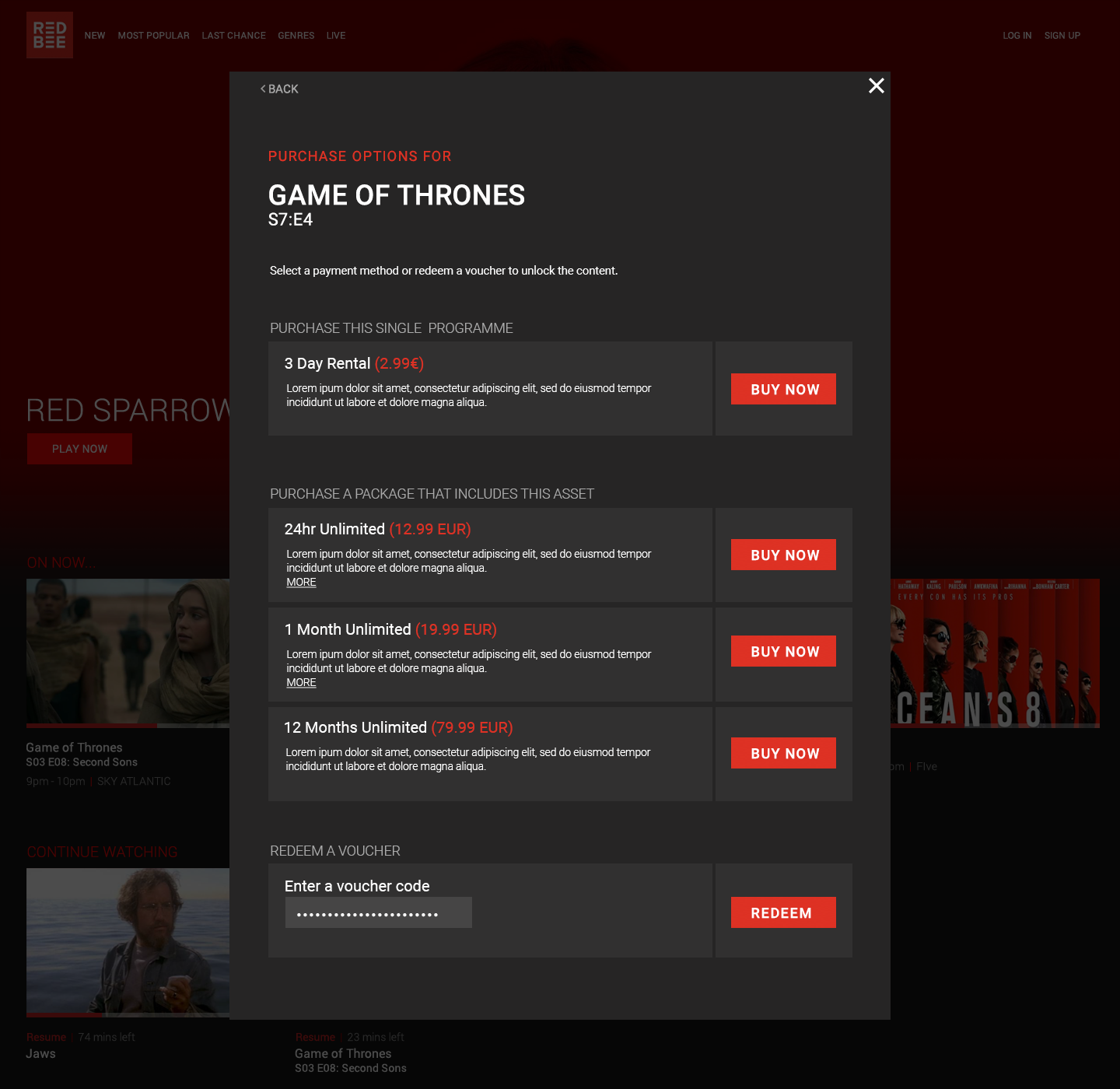
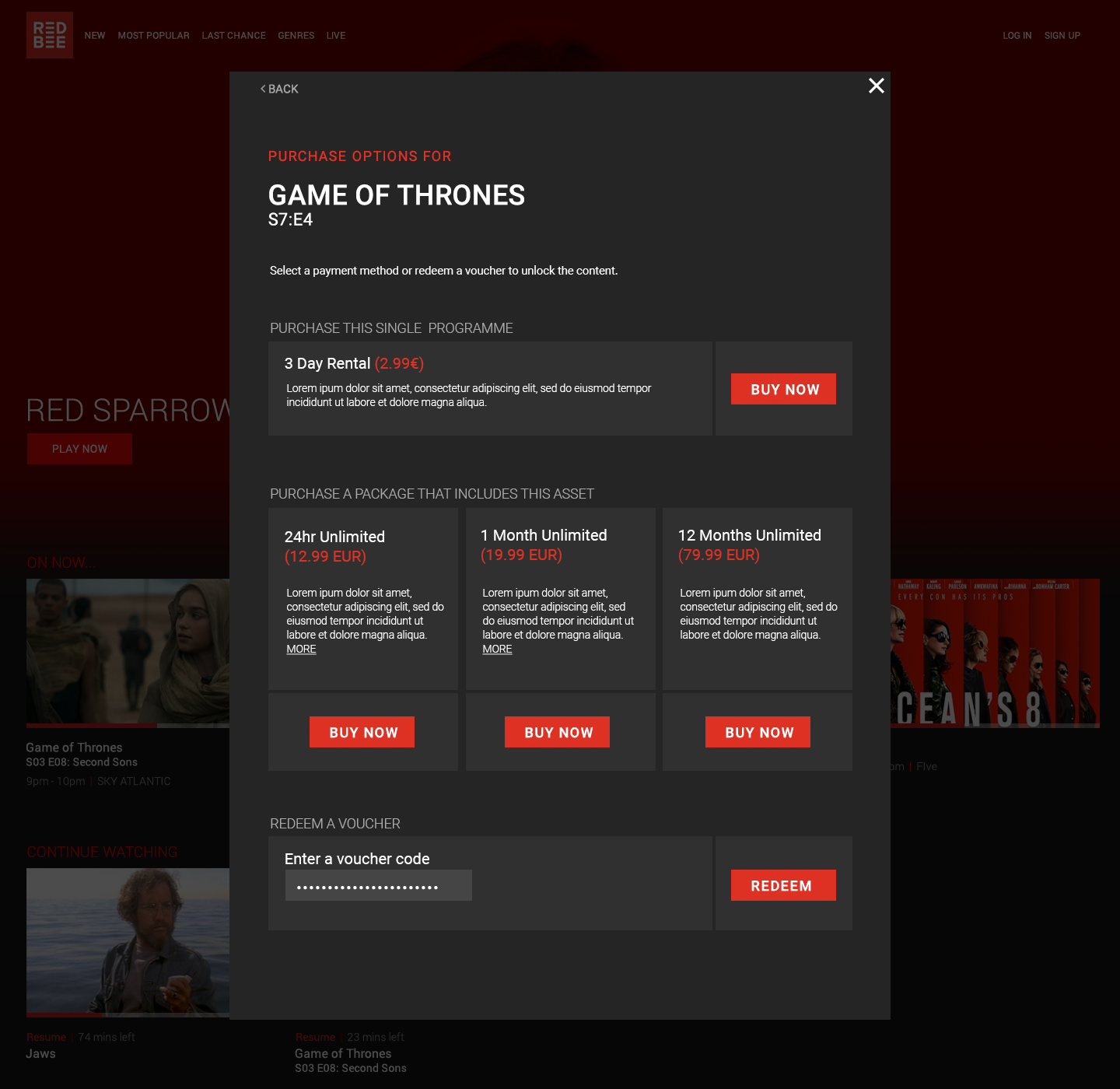
ALIGNED UX WITH COMMERCIAL GOALS
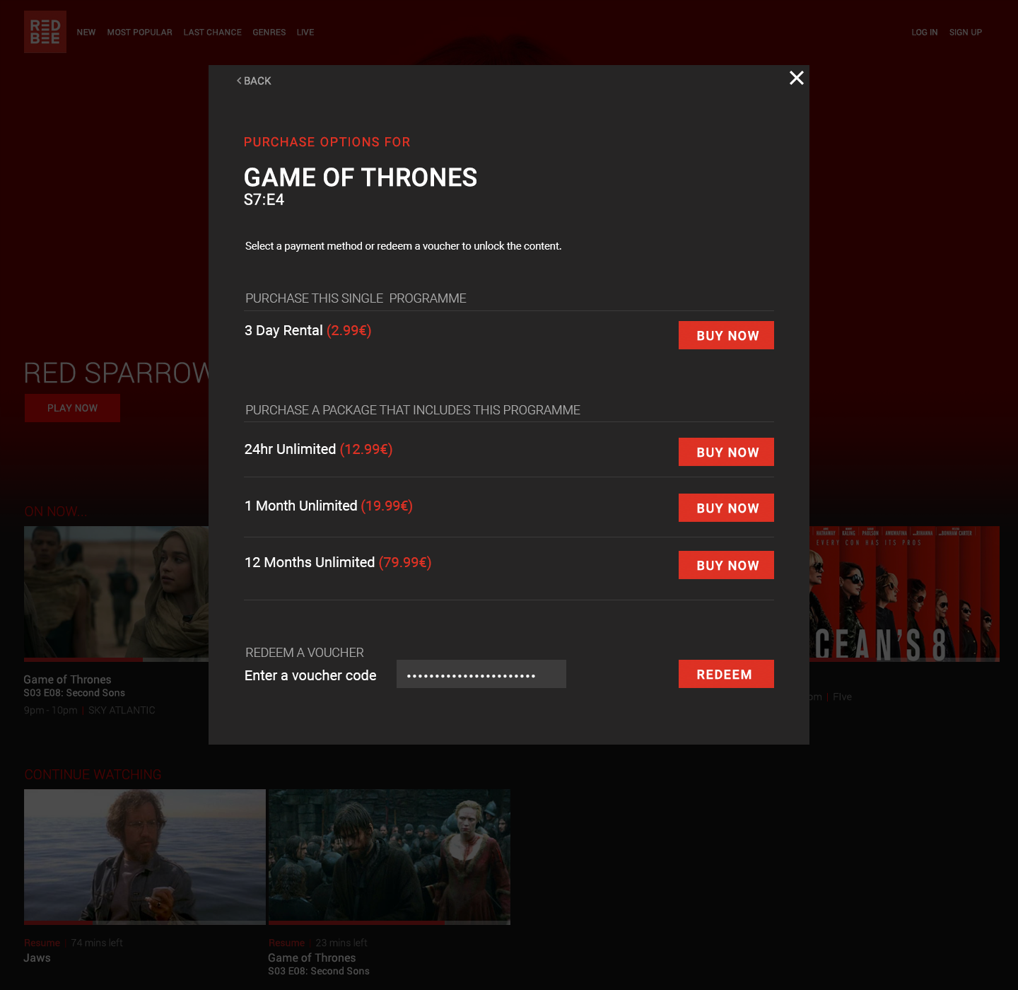
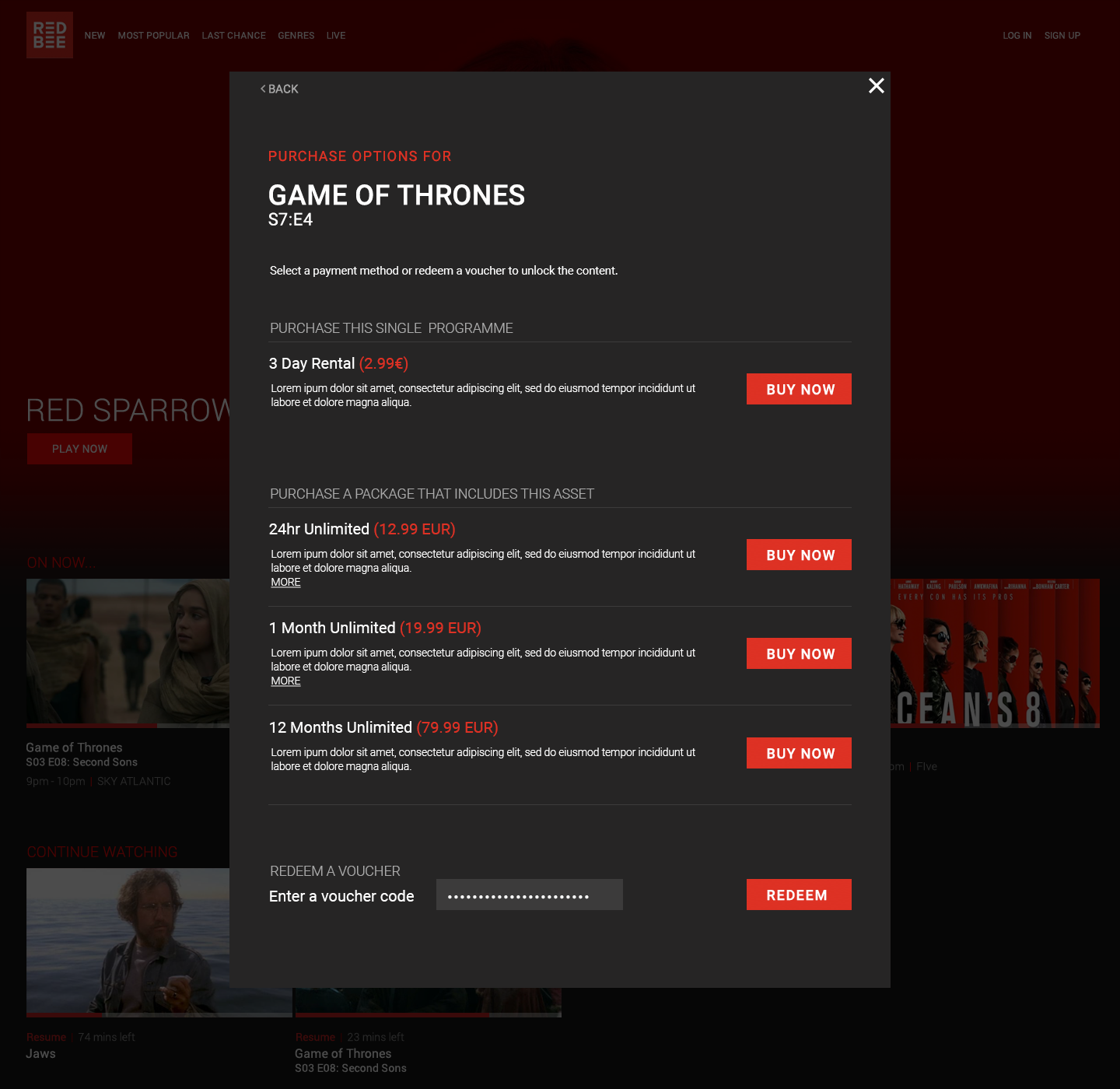
A/B Testing to integrate flexible commercial requirements into the experience.
Improved subscription and payment flows
Reducing friction between discovery and conversion
Ensured monetisation points felt natural within the user journey
This helped connect user experience decisions directly to product performance.
OUTCOMES
Reduced friction in onboarding, improving user activation
Increased engagement through more effective content discovery and navigation
Created a clearer path from entry → content → playback, improving overall flow
Enabled faster iteration and consistency through a modular design system
Shifted the product toward a more conversion-aware, user-driven experience